The digital landscape is no longer just about looking good; it’s about performing brilliantly. In 2025, your website isn’t a brochure—it’s your most critical business tool. User expectations are higher than ever, and search engine algorithms, like Google’s, are placing unprecedented weight on the actual user experience (UX) delivered by your design.
For businesses aiming to move beyond just 600 impressions to thousands of qualified visitors and high conversions, embracing the future of web design is not optional—it’s a prerequisite for survival. We believe that the convergence of aesthetics, speed, and technology defines success.
Here are the top seven non-negotiable website design trends that every business must understand and implement in 2025 to secure a competitive edge, improve SEO, and maximize conversion rates.

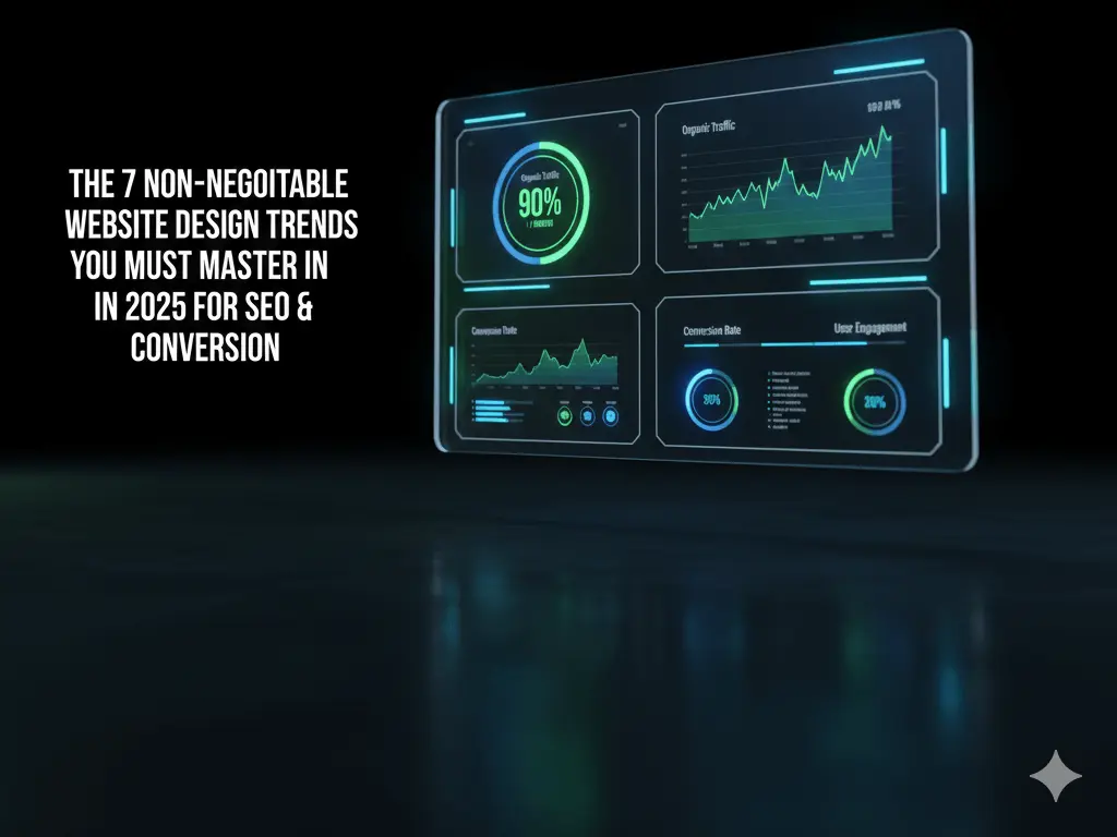
Dark mode has matured from a flashy trend to a standard user expectation, driven by reduced eye strain and device battery conservation. However, the 2025 evolution of this trend is Adaptive Contrast.
Adaptive Contrast dark mode intelligently adjusts the color scheme based on ambient light and user settings, ensuring that critical text and interactive elements maintain WCAG (Web Content Accessibility Guidelines) compliance for perfect readability. It’s no longer enough to invert colors; the design must dynamically manage the luminosity ratio between foreground and background.
Design a dark mode that utilizes neon or glowing accent colors (like a neon blue or sharp green) only for key interactive elements (CTAs, buttons, form fields) while keeping primary text areas at optimal contrast levels. Ensure the transition is seamless and persistent across sessions.
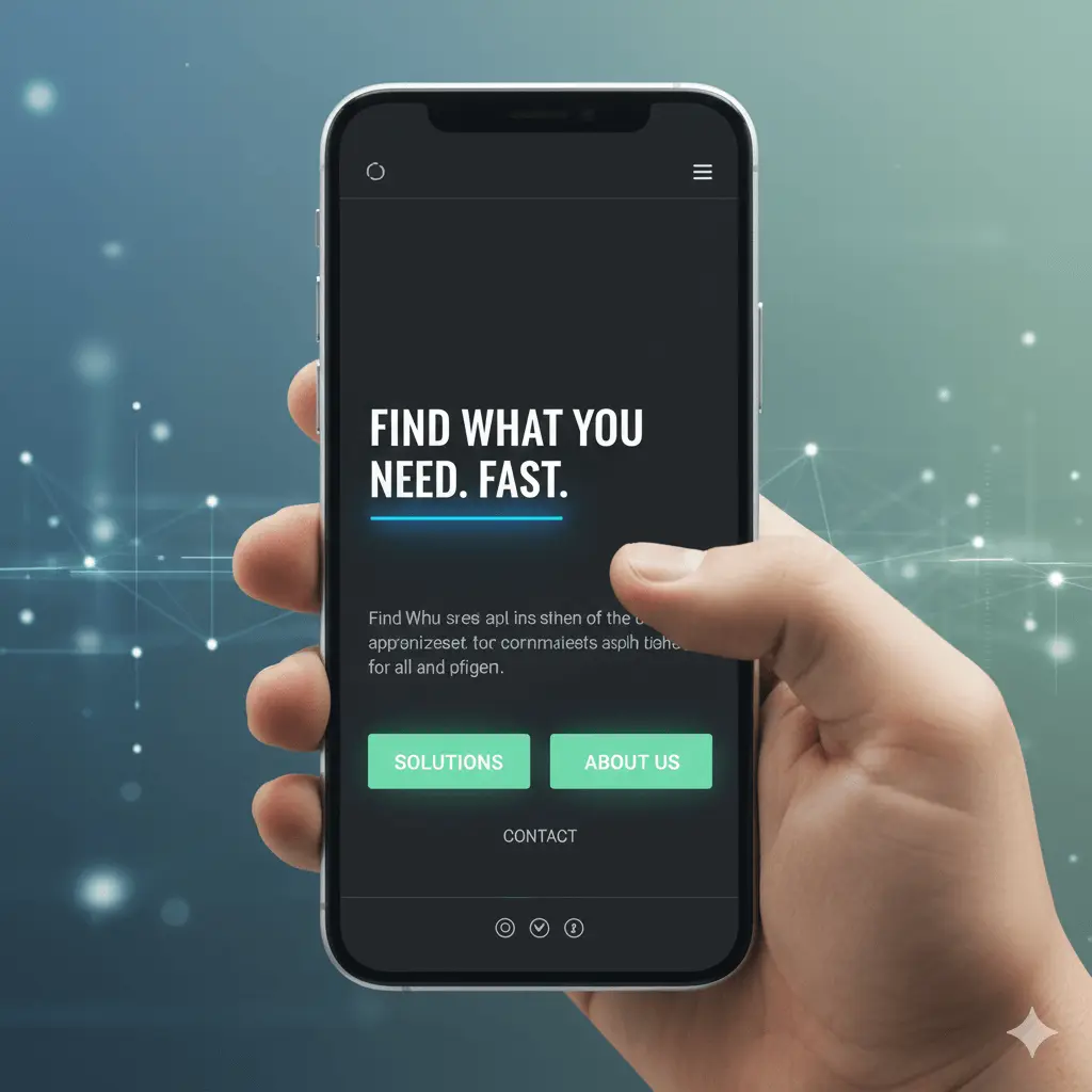
With Google’s continued commitment to mobile-first indexing, complex, bloated navigation is a direct ranking detriment. The design trend for 2025 is a severe reduction in cognitive load through minimalist navigation.
Simplified, purpose-driven navigation that strips away anything non-essential. This means the primary menu (often a sticky header) only contains 3-5 high-priority links, relying heavily on modern conventions like hamburger menus and strategically placed footers for secondary links.
Audit your main navigation. Remove redundant links. Use a “Services” or “Solutions” drop-down menu instead of listing every single service line. Ensure all menus are 100% finger-friendly for mobile users.
Micro-animations have moved past being ornamental; they are now a functional part of the user interface (UI) that provides feedback and improves guidance.
Small, subtle animations triggered by user interaction (hover effects, button clicks, form submissions) or page transitions (scroll-triggered effects). In 2025, these animations are deeply integrated into the UX to confirm actions, guide the eye, and make the interface feel responsive.
Prioritize performance. Any motion must be lightweight and not contribute to layout shift (CLS)—a major Core Web Vitals issue. Use CSS and WebGL minimally and efficiently. Rule: If an animation doesn’t serve a clear purpose (feedback, guidance, or delight), remove it.
Artificial Intelligence is transitioning web design from static templates to dynamic, real-time user interfaces. This is the single biggest design trend for conversion optimization in 2025.
Design that adapts its content, images, layout, and CTAs based on the visitor’s history, location, referral source, or demographic data. This includes smart chatbots that offer instant, context-aware support and personalized product/service recommendations.
Start small by personalizing headlines and primary CTAs for visitors coming from specific campaign pages or referring domains. Integrate a quality, AI-powered chatbot that can triage and guide visitors to the right information 24/7.
As voice search becomes integrated into everything from smart homes to mobile devices, websites must be structured to communicate effectively with voice assistants.
Designing not just for how a user sees the page, but how a machine reads and interprets the page. This relies on clean, semantic HTML5 structure, proper use of heading tags (H1, H2, H3), and extensive application of Schema Markup (structured data).
Ensure every page has one clearly defined H1 tag. Use H2 and H3 tags to structure your content like a logical outline. Use JSON-LD Schema Markup (especially for FAQ, How-To, or Services) to explicitly tell search engines what your content is.
Static images are fading as the primary visual communication tool. In 2025, dynamic, immersive elements will define a premium digital experience.
The use of WebGL, advanced CSS, and lightweight 3D libraries to create interactive product previews, virtual tours, dynamic data visualizations, and full-screen visual storytelling experiences that react to the user’s scroll or mouse movement.
The Performance Warning: While powerful, 3D elements can crush page speed. Use optimized assets, lazy loading, and compress files aggressively. Prioritize performance optimization above all else to ensure the visual delight doesn’t turn into an SEO penalty.
This trend is driven by corporate social responsibility, but it has a direct, measurable impact on performance and SEO. An “eco-friendly” website is simply a high-performance website.
Designing and developing websites that consume minimal energy and resources. This means choosing a green web host, using dark colors (which require less energy for display on OLED screens), and most importantly, reducing the weight of the page.
Aggressively optimize all images (WebP format is key). Minimize third-party scripts and excessive fonts. Prioritize loading speed as a core design principle, not just a post-launch optimization task.

Click to chat
No spam. No commitment. Just real insights.
We’ll contact you on WhatsApp about your audit. No commitment required.
No spam. No commitment. Just real insights.
We’ll contact you on WhatsApp about your audit. No commitment required.